Overview
High Gardens Eastwood is a 10 floor development located in Eastwood, NSW. The Hoyne team was appointed to develop a brand identity and subsequent marketing roll-out. Hoyne prides itself on effectively defining places with meaning and purpose, helping the property market sell faster. I was involved in the concept phase through to execution. Here is a summary of the design process taken from concept to execution.

Team
Creative Director: Matt Barrat
Senior Designer: Nerida Orsatti
Designer: Tina Lee
Web development: Rachel
Photography: Tina Lee & Jason Loucas
Client: Winten Property Group
Business objective
Pre-sell apartment units to potential buyers.
Design objective
Create a brand identity that communicated the key messages to potential buyers.
Research Findings
I began the research phase by gathering insights about the development itself, the location and surrounding competitors. I created a snapshot for the team to use to guide the messaging phase of the design process.
Understanding the buyer
Anticipated Target Audience
We created a snapshot of the anticipated buyer groups which guided out key messaging.

Key Messages
Together with the team, we created three core messages that guided our branding. Since our audience was mostly investors, location was a key factor in this project due to the proximity to schools and public transport. The development’s differentiating feature was its rooftop garden sanctuary making it a key selling point to buyers in terms of architecture.

Naming Exploration
Naming exploration was done as a team to brainstorm naming combinations for the new development. The final name for the development is ‘High Gardens’.
Design Development
The logo lockup was designed by Nerida and I, reflecting the rooftop garden feature of the development.
Website Design
My role was to design the web page for the development keeping in mind the goal to pre-sell units off the plan. I decided a single page scroll that acted like a landing page would be the most effective to educating the audience about the apartment and allowing the user to register their interest at any point during the scroll.

(Above: Website Sitemap)
Below is the final design of the website before it was delivered to the developer to build. View the live website here.
(Above: Website landing page design)
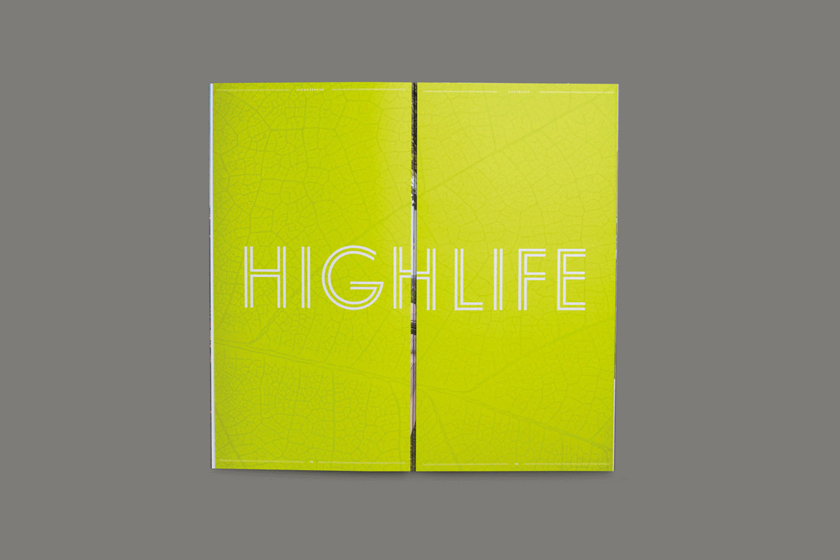
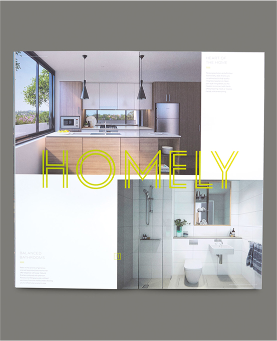
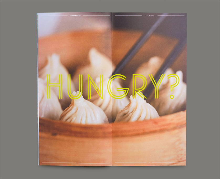
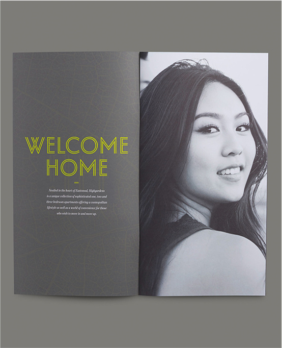
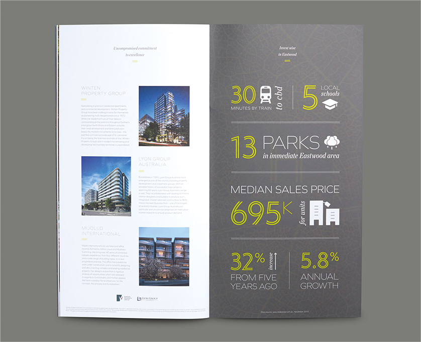
Print Brochure Design
The print brochure was the centre piece of the creative collateral. I was involved in the design from the beginning and I photographed some of the lifestyle images used in the brochure and website. We wanted to brochure to be bright and friendly. The four page gatefold on page two reveals an unexpected garden sanctuary reflecting the development’s main feature.